
AkhilAbraham
India


Step 1 (this contest) - Make a frame for how the design will be.
Step 2. Implementing these changes into Enfold Childtheme (design changes)
Part 1 budget: $180
Part 2 implementing the changes we will have a budget of $500.
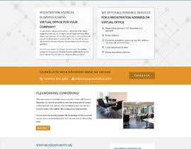
The site needs to be made visually more appealing / professional.
Its a wordpress theme (Enfold). Basically I need someone to update the design and make the lists / background etc all visually improved.
https://easystartoffice.com/ is the site.
What we are looking for:
Design update for wordpress (Enfold) site. I think it involves making a childtheme.
More professional design
Still a fresh look
Buttons, lists, pricing, tabs, forms to be more ''aesthetically pleasing''
Background and layout can be improved
On ''pricing'' we will add a second location from next week. So all the pages which were before only about one location, now need to be organized differently so we can share our information and packages for two locations.
Example of a more ''finished'' look:
https://lawyersinnetherlands.com/(note how the images and icons are fitting the purpose) Colors are in harmony and look professional.
https://www.amsterdamcoworking.nl/(competitor, looks finished, good site)
Specific changes:
Header
Contact details / some quick contact information.
Logo can be incorporated better in to the styling.
Navigation buttons:
To be more ''finished'' as a look. Not minimalistic like it is now.
Make the language selector stand out more. (such as in amsterdamcoworking.nl)
Color of bar under navigation - Color needs an update to more professional dark blue.
Footer:
Same type of professional color as the navigation bar.
The lists in the footer (widgets) have to look more custom and ''finished''. Not like a cheap wordpress.
(styling) The light blue for all bold letters confuses the visitor with the light blue for hyperlinks
Home Page
Background picture - Needs to be less high and perhaps a better picture. So that it does not take away so much space from the fold.
The 3 columns can be styled ''more finished''.
Button is nicely contrasting in color (for conversions), but not really professional styled.
Page 2. (Zakelijk registratieadres Rotterdam)
Update styling to fit home page. Perhaps have more interactive references to ''pricing page'' (tarievenpagina - in Dutch). Such as a button.
Checkmarks such as V need to be more professional.
Page 3. https://easystartoffice.com/tarieven-registratieadres/
Lists does not look serious right now. It needs to be easy to read but look personalised in styling.
It will have to contain a list for two locations (Rotterdam, and Amsterdam)
We do not change significantly page ''flexwerken'' or ''contact'' for now. Ideas are welcome however.
This page Contains pricing for ''Pakket A'' Pakket B and PAkket C.’’ (Which are packages).
these 3 packages of pricing are for the location in Rotterdam. We will open a new location, so technically we would need two times this table of 3 columns.
Because that will not look nice with 2x 3columns (for both locations), we would like to ask how to graphically present this information properly.
Page 4. https://easystartoffice.com/register-now/
This needs a small makeover to look more custom / professional
“Listens to input and excellent custom design (design contest). Puts in effort. ”
![]() hristo7, Netherlands.
hristo7, Netherlands.


Publica tu concurso Fácil y rápido

Consigue toneladas de propuestas De todo el mundo

Elige la mejor propuesta ¡Descarga fácilmente los archivos!
