Freelancer:
E1matheus
Unwind logo
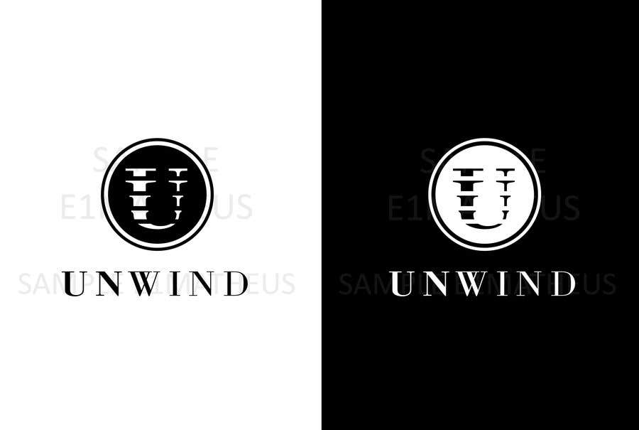
For this concept I created a symbol based on a fading letter "U", it's fading like sound waves in a downward direction, refering to the label's downtempo music. For the text I chose a Transitional typeface, matching the one in the symbol; the typeface's stroke becomes thinner from left to right, and the weight decreases from letter to letter (from medium, to regular, to light in the last couple of letters), this makes reference to the process of relaxing/unwinding. I attached monochromatic versions in black and white. If you have any questions about my work don't hesitate to ask, have a great day.


