Design only for hosting company - 2 pages

  • Estado: Closed
  • Premio: $700
  • Propuestas recibidas: 24
  • Ganador: H8888

Resumen del concurso

Design of new website (2 pages - high resolution design only - no coding required, it only need to be prepared so that I can hire you or rent somebody to do the html-job). Improving or simplifying the logo is preferable (I don't like the 3D/gradient effect and logo is to complex).

Contest will be made Guarantee as soon as ONE OK entry is posted - in most cases this happens after 1-2 days. I have more than 100 contests/projects completed here, so I'm serious.

Current website: https://webspesialisten.no

# Think simple, simple, simple. I would rather have to little border/frames/shadows and colors than to much. Color is good, but only if used a few times.

# How to compete - rules:
1. Submit an sketch/drawing of a Front Page
2. If you get a good feedback, submit a drawing of one content-page (a dedicated server content page)
3. If you win, you hand over the high quality drawings that should be ready to be converted to a website (you do not have to convert it)
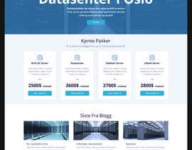
# What we sell

Product Sections: Managed Dedicated servers, Managed VPS, SMTP-servers, Wordpress Hosting and many other things.

Our company is a driven as a familiy-business, with no investors or profit-hunger - and we have built our own data center.
That is something I want to convey on our frontpage.

Somehow, any ideas/graphics that shows relations with something Managed or hands-on-service is plus.
I prefer real images and will pay for images from any image-bank if you use that for your design.

# Prefered Colors and style - Ideas

Google-type font, that is soft and easly readable. Use lot of air and few borders.
Fixed width, at least on content-part.
Less is more, I like conservative design with one color (love bg-primary, the blue color, from Boostrap 3, not v4) + grey. bg-info/bg-danger can also be used.
I do not like yellow, ligth green/ligth blue, brown or anything in 3D.
Logo can be simplified to text-looking logo not in 3D.
Freel free to use Font Awesome icons (both free and pro version of them, I have access to both).
Boostrap v3-ish style on the design.
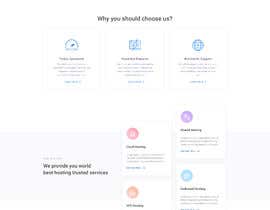
# Front Page

- Some kind of text with a dominated space to explain who we are and what we do.
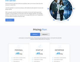
- Only static single non-rotating banner on frontpage - not gigantic image, less is more.
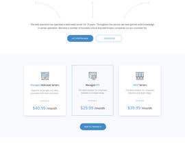
- 3 or more "Featured" products from the Main Sections stated above, to promote the Content Pages for those type of products. You may or may not include a From-price on them.
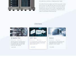
- Similar a list of blog-articles, 3-5 latest blog-entries.
- I prefer if Front Page is viewable without scrolling with a big screen (similar as our current website).
- Boostrap v3 colors is prefered over Boostrap v4 colors.
- Should at least be doable with Bootstrap v3 (but the html-production is not included, you don't have to do that).
- Do NOT, I repeat, do NOT include "Testemonitals", "Quotes", "Team" or similar. I'm not using any of this, so do not submit design with content like that.
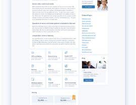
# Content Page

- Our content-page will be where our products is mainly shown, frontpage is only a preview. Look for example here (managed server content page): https://webspesialisten.no/dedikert-server
- Should have same header/menu as your front page-design and not be any higher than on our current website.
- In the content-area of the Content Page, almost like a landing page: Image of product, Short text intro to the Product, 1 to 3 pricing columns, bullet-list with 3-8 top features in our product (like on a landing page), a simple FAQ-clickable list (the type you click on each sentece to expand), a call-to-action banner. To the rigth side/column: Related Pages and Blog-entries.

You can get basic feel of what I like by checking out current website.

I like the real photos of data center, servers and similar. Our content pages is a bit crowded with text - I hope that your design will allow the same amount of text, just better hidden.

# Nice designs:
https://clearbit.com/ (just a bit to wide for me)
https://stripe.com/payments

Habilidades recomendadas

Comentarios del empleador

“Very positive and good designer.”

Imagen del perfil DeltaUser, Norway.

Principales propuestas de este concurso

Ver más participaciones

Tablero de aclaración pública

  • DeltaUser
    Organizador del concurso
    • 5 años atrás

    The contest is now over. To the ones who didn't win, but got a 6-star - I have saved your nicknames and images and will contact one or more of you for some other sites I have, as they better match some other pages I have. Maybe later this month or early next year. So please don't throw away your design totally even if you didn't win!

    • 5 años atrás
    1. dilshanzoysa
      dilshanzoysa
      • 5 años atrás

      Thank You for choosing a worthy winner and for operating this contest in a professional manner. It would be great to work with you on upcoming projects if my design style suits your future projects. Best Regards

      • 5 años atrás
  • dilshanzoysa
    dilshanzoysa
    • 5 años atrás

    Please check #169 Thanks

    • 5 años atrás
  • DeltaUser
    Organizador del concurso
    • 5 años atrás

    I'm doing a last walkthrough now to see the best designs. Note that I will remove those who didn't get to the top just to get an easier overview. It doesn't meen I don't like the design at all, just means that competition was good. Please don't submit or start a new design unless asked for now.

    • 5 años atrás
  • rajchoudhary265
    rajchoudhary265
    • 5 años atrás

    Hello sir kindly check my entry#162 and #164 and let me your valuable feedback i hope you like my design thanks.

    • 5 años atrás
  • codervai
    codervai
    • 5 años atrás

    please check my entry #154 and #163 and let us know your thoughts. Thanks!

    • 5 años atrás
  • rajchoudhary265
    rajchoudhary265
    • 5 años atrás

    Hello sir kindly check my entry#162 and let me your valuable feedback i hope you like my design please contact me via message thanks.

    • 5 años atrás
  • nooraincreative7
    nooraincreative7
    • 5 años atrás

    Dear Contest Holder, Please check my entry #161 and thank

    • 5 años atrás
  • rajchoudhary265
    rajchoudhary265
    • 5 años atrás

    Hello sir i am working on it please don't close before the time i am sure you like my design thanks

    • 5 años atrás
  • Bkmraj
    Bkmraj
    • 5 años atrás

    plz check #142

    • 5 años atrás
  • DeltaUser
    Organizador del concurso
    • 5 años atrás

    There are now at least 3 designs in the top 3 category, where all three are close to what I could accept with small adjustments. Two of them are very similar in design (big and lots of air) and one is totally different (more compact). I have seen every entry and commented and given star on the best ones. I will try to comment or give star on those designs I feel is a bit behind. Anyways, don't start any big projects now, as the deadline closes in. On those designs that is not commented or given star, I see that it would be to ask to much to turn things around totally, so I will try not to give you false hope.

    • 5 años atrás
    1. kalaja07
      kalaja07
      • 5 años atrás

      thank you!

      • 5 años atrás
  • nooraincreative7
    nooraincreative7
    • 5 años atrás

    Dear Contest Holder, Please don't close before the days. Thanks

    • 5 años atrás
  • Batto14
    Batto14
    • 5 años atrás

    Please check #140 . Thank you

    • 5 años atrás
  • sleekdesigner1
    sleekdesigner1
    • 5 años atrás

    Workin' please don't close early.

    • 5 años atrás
  • Isha3010
    Isha3010
    • 5 años atrás

    Please check #125 and left your valuable feedback, Thanks.

    • 5 años atrás
  • amitk86
    amitk86
    • 5 años atrás

    Hi, I'm working on your contest. Please wait before choosing any final winner. Thanks

    • 5 años atrás
  • GraphixTeam
    GraphixTeam
    • 5 años atrás

    please feedback about #110 thank you

    • 5 años atrás
  • DeltaUser
    Organizador del concurso
    • 5 años atrás

    Full width header-background and full width footer-bakckground.
    I try to show here:


    |---------Logo---------------------------- right side navbar--------|


     |---------- THIS is centered middle -------------|
      Main area is here, fixed in the center/middle,
      maybe 700-900px or about there

      Featured Products
      Call-to-action
      About Us
      Some pricing maybe
      |---------- / end of centered middle -------------|


    |---------Footer -------------------------------------------------|


    (|=edge of browse window, max width)

    • 5 años atrás
  • DeltaUser
    Organizador del concurso
    • 5 años atrás

    Update: I have now gone through all designs up to #121 . I have seen every contribution up to that, but I haven't commented on absolutely every one (because I needed time to think). I will go a new round tomorrow and I will swipe through also those that I have not excluded up to 121. Today, there was one design I gave 5 stars to for the first time, made by H888, and it was kind of compact design - still with an air feel - so it suprised me as well. Maybe this competition has made me open up for compact designs as well. I will continue to check a little more today, but the next main check will be tomorrow.

    • 5 años atrás
  • DeltaUser
    Organizador del concurso
    • 5 años atrás

    Also a note: I have come to the conclusion that I like the best when the header is wide and content is fixed from the header until the wide-footer. Similar to this type of design (to much colors/blue here, but you get the idea I think): https://webber.no - I repeat, I don't particular like that design, but a wide header, then narrow page-body in center and then wide footer is the best design for me.

    • 5 años atrás
  • Isha3010
    Isha3010
    • 5 años atrás

    Please check #105 and left your valuable feedback so that I can improvise my design. Thanks.

    • 5 años atrás
  • sirajkhan1992
    sirajkhan1992
    • 5 años atrás

    working..........................

    • 5 años atrás
  • DeltaUser
    Organizador del concurso
    • 5 años atrás

    I'm now going throuh every contribution to find the best designs so far. There are no clear winner-design so far, so feel free to contribute with new designs. However, it migth be good entries when i start to go through them now. There are still 5 days left of competition, I plan to let the competition run until that. Please note that using template design is not what I'm looking for.

    • 5 años atrás
  • Batto14
    Batto14
    • 5 años atrás

    Please check new updates on #109 . Thank you

    • 5 años atrás
  • Qweser
    Qweser
    • 5 años atrás

    Please Check my New entry #92

    • 5 años atrás
  • Webicules
    Webicules
    • 5 años atrás

    Please check my entry #88 and share your feedback.

    • 5 años atrás
  • Webicules
    Webicules
    • 5 años atrás

    Please check my entry #86 and share your feedback.

    • 5 años atrás
  • WebCraft111
    WebCraft111
    • 5 años atrás

    Please provide feedback for my design #72, #73, #74 Thank you.

    • 5 años atrás
  • Batto14
    Batto14
    • 5 años atrás

    Please check my updated design on #70 . Thank you

    • 5 años atrás
  • Webicules
    Webicules
    • 5 años atrás

    Please check my entry #65 and share your feedback.

    • 5 años atrás
  • Batto14
    Batto14
    • 5 años atrás

    Hello, please check #62 and provide feedback. Thank you

    • 5 años atrás
  • rendez
    rendez
    • 5 años atrás

    hi, working on an idea, will get back asap.

    • 5 años atrás
  • Nihal Graphics
    Nihal Graphics
    • 5 años atrás

    working on this

    • 5 años atrás
  • DeltaUser
    Organizador del concurso
    • 5 años atrás

    The company name is spelled/designed "Webspesialisten". You may make a small difference, like a sligthly bigger s, like "WebSpesialisten", but it should be even less noticeable than here. The word itself means Web Specialist, but it is written in one word in my language. So avoid having Web and Spesialisten on different lines for example.

    • 5 años atrás
  • DeltaUser
    Organizador del concurso
    • 5 años atrás

    This is the three top designs so far. Because the thubnail is small, it migth not give a full expression of the design, but I want to show you how beutifull simple the design can be. Less is really more, don't complicate the design to much. I want it plain, not glossy. I think a plain design is the most difficult to make, even though it migth seem easy. https://cdn6.f-cdn.com/contestentries/1456177/16914724/5c0ba0ffd8b94_thumb900.jpg
    https://cdn5.f-cdn.com/contestentries/1456177/18974195/5c0a8b4c45108_thumb900.jpg
    https://cdn5.f-cdn.com/contestentries/1456177/17145071/5c0a7f3a800a5_thumb900.jpg

    • 5 años atrás
  • Dream Line Production
    Dream Line Production
    • 5 años atrás

    please can you upload the logo in larger transparent format? may be vector?

    • 5 años atrás
    1. DeltaUser
      Organizador del concurso
      • 5 años atrás

      I have uploaded big image in layered .psd, the best I could do. Attached to project.

      • 5 años atrás
    2. Dream Line Production
      Dream Line Production
      • 5 años atrás

      Thanks for the logo PSD

      • 5 años atrás
  • DeltaUser
    Organizador del concurso
    • 5 años atrás

    So far, there are no contributions I'm really really keen on. So feel free to submit new designs.

    • 5 años atrás
  • babupipul001
    babupipul001
    • 5 años atrás

    you need only psd/mockup design

    • 5 años atrás
    1. DeltaUser
      Organizador del concurso
      • 5 años atrás

      Yeah, that is the only thing required. If you want to do more, you are welcome to :)

      • 5 años atrás
  • greenarrowinfo
    greenarrowinfo
    • 5 años atrás

    Working, please wait..

    • 5 años atrás
  • girmax
    girmax
    • 5 años atrás

    Hello! Working on your project! #guaranteed please!

    • 5 años atrás
    1. DeltaUser
      Organizador del concurso
      • 5 años atrás

      Guaranteed now.

      • 5 años atrás
  • Dream Line Production
    Dream Line Production
    • 5 años atrás

    Im working.

    • 5 años atrás
  • WebCraft111
    WebCraft111
    • 5 años atrás

    Please provide feedback for my design #8 Thank you

    • 5 años atrás
  • jahanzebnaeem
    jahanzebnaeem
    • 5 años atrás

    Hi,
    Do you have any preferences in terms of colour combination?

    • 5 años atrás
    1. DeltaUser
      Organizador del concurso
      • 5 años atrás

      As little colors as possible, I feel that colors are best when they are appearing here and there and not everywhere, if you understand. A lot of white/gray (maybe even black) and then elements of colors some places. But bootstrap v3 colors is usually safe, faded, soft colors - not really brigth ones like boostrap v4 introduces.

      • 5 años atrás
  • septioz
    septioz
    • 5 años atrás

    Im fluent with CSS and HTML, would you accept code+design?

    • 5 años atrás

Mostrar más comentarios

Cómo comenzar con los concursos

  • Publica tu concurso

    Publica tu concurso Fácil y rápido

  • Recibe montones de propuestas

    Consigue toneladas de propuestas De todo el mundo

  • Elige la mejor propuesta

    Elige la mejor propuesta ¡Descarga fácilmente los archivos!

Publica un concurso ahora o únete a nosotros hoy