
Motiurlencer
Bangladesh


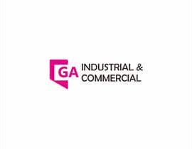
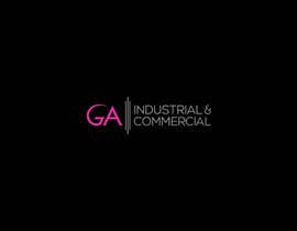
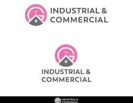
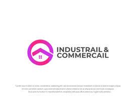
I am trying to 'improve' and 'upgrade' a logo which is for a Commercial Real Estate Agency. We need to bring this into the 'modern times'.
We love the main letters in pink as it is mainly woman run and although we like the logo - we know it looks like something from the 1990s at the moment - so it would be good to somehow 'improve' it in some way.
Maybe the letters and shapes of the 'GA' need to be spread apart more and given more 'air' in between the elements, and maybe bolder in some way,
It needs to represent a strong modern very proactive and service orientated group of people.
The circle in the letter A actually represents the dot of the letter i, but unless that works well we dont have to incorporate it... see what you think.
Do you think you an improve our logo really well?


Publica tu concurso Fácil y rápido

Consigue toneladas de propuestas De todo el mundo

Elige la mejor propuesta ¡Descarga fácilmente los archivos!