Logo Design For Wedding Proposals Website

  • Estado: Closed
  • Premio: $200
  • Propuestas recibidas: 6
  • Ganador: violetweb2

Resumen del concurso

Looking for logo design submissions for a website that is about Wedding Proposals & Engagement Rings

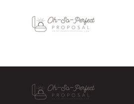
Website Name: “OH-SO-PERFECT PROPOSAL”

Our clients are men looking for wedding proposal ideas and women looking for engagement rings.

Full Logo Requirements:
• full logo should have a ‘logo/icon part’ + site name
• Any fonts should be easy to read (good example: weddingforward.com) at any size
• Need to see 2 versions of the logo: on white background, as well as all-white-color on dark background

• 

DO NOT:
• do not use a RING image as part of the text or instead of letter “O”
• do not use more than 2 fonts in one design or very curved fonts the are hard to read
• Do not use bright and aggressive colors

Final file should be either very high resolution Photoshop file (PSD) (5000px in length) or an Illustrator vector graphics.

Habilidades recomendadas

Comentarios del empleador

“Loved working with @violetweb2. She made adjustments as requested and her logo was the most original one. Thanks!”

Imagen del perfil wffrpro, Canada.

Tablero de aclaración pública

  • wffrpro
    Organizador del concurso
    • 7 años atrás

    Thanks everyone for submitting. After reviewing many entires, i'd like to make some clarifications as i dont think the designs are going in the right direction.

    1. Don't make so much focus on 'OH-SO'. The key is "Perfect Proposal"
    2. Dont make the drawing above the text, it makes the logo too tall
    3. Some logos look very corporate, this is not the direction

    I think our ideal logo would look with an icon on the left and text in one or two lines

    The icons i seen so far are very plain.
    I found some examples, that if you modify them, they would look pretty good

    https://thenounproject.com/term/proposal/341436/ - like side profile of the box with ring, but without the hand

    Look forward seeing some ideas with modified versions of the icons above.

    • 7 años atrás
  • SeleneChacin
    SeleneChacin
    • 7 años atrás

    Please check #9

    • 7 años atrás
    1. wffrpro
      Organizador del concurso
      • 7 años atrás

      I think this is too similar to Wedding Forward logo :)

      • 7 años atrás
  • tom9696
    tom9696
    • 7 años atrás

    #2. thanks:)

    • 7 años atrás
    1. wffrpro
      Organizador del concurso
      • 7 años atrás

      After renewing entries, I think logo on the side would be best.

      • 7 años atrás
  • cbarberiu
    cbarberiu
    • 7 años atrás

    and #26 and #27

    • 7 años atrás
    1. wffrpro
      Organizador del concurso
      • 7 años atrás

      interesting designs, considering

      • 7 años atrás
  • SHshohag89
    SHshohag89
    • 7 años atrás

    Please check #38 #39 #40

    • 7 años atrás
    1. wffrpro
      Organizador del concurso
      • 7 años atrás

      this looks too corporate.

      • 7 años atrás
  • cbarberiu
    cbarberiu
    • 7 años atrás

    please check #22 #23 thank you.

    • 7 años atrás

Mostrar más comentarios

Cómo comenzar con los concursos

  • Publica tu concurso

    Publica tu concurso Fácil y rápido

  • Recibe montones de propuestas

    Consigue toneladas de propuestas De todo el mundo

  • Elige la mejor propuesta

    Elige la mejor propuesta ¡Descarga fácilmente los archivos!

Publica un concurso ahora o únete a nosotros hoy